Viversum
Redesign
Brand Design & Art Direction
Secrets of the peony
In late 2022, we embarked on the official redesign journey for the Viversum brand, marking its first interface overhaul in 20 years. While the previous brand refresh missed the website, this time we seized the chance to bring the brand up to date. Our primary aim was to develop a logo that retained a gentle, meaningful essence without immediately evoking spirituality.
Navigating through the branding landscape, one of our main challenges was to steer away from stereotypes and disassociate the brand from any murky or dubious connotations. Drawing inspiration from the moon's multifaceted significance in both natural and spiritual realms, I conceived a logo design that merged a circular form with a V-shaped hook reminiscent of the Viversum name.
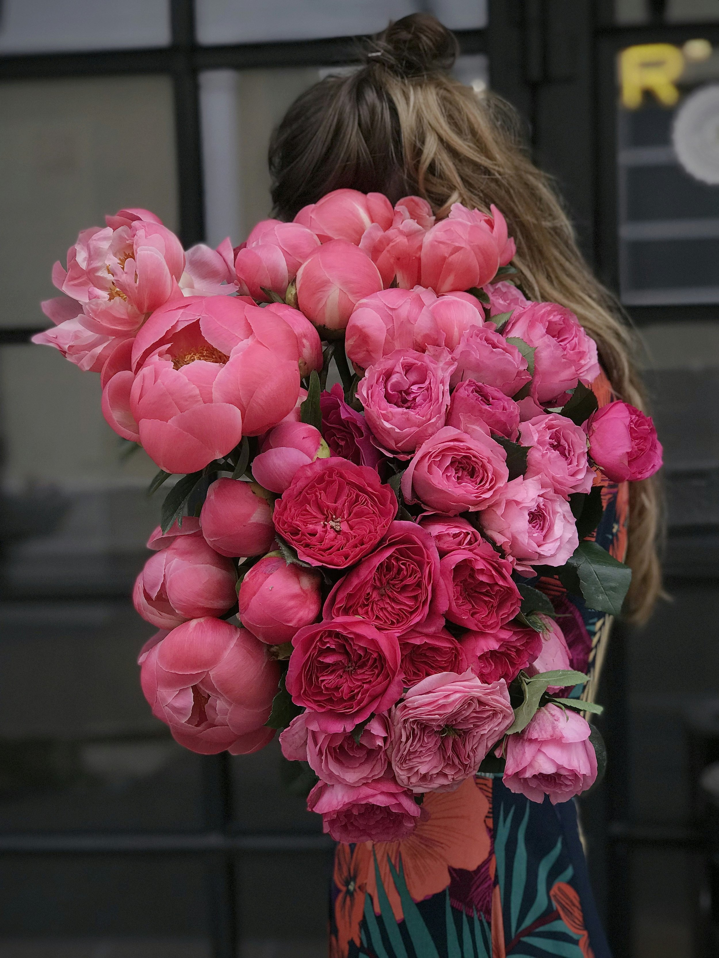
This design allowed for diverse interpretations, presenting itself as a closed peony flower, symbolizing femininity, new beginnings, healing, and compassion. Alternatively, it could evoke imagery of a soaring seagull, the sun rising over mountains, or even a beat emerging from a shell. The versatility of the design was confirmed through a comprehensive customer survey, where it emerged as the clear favorite, cementing its place as the new face of Viversum.
